Enter password to view Website Audit
Analysis
Website
Maple
Analysis
Website
Maple
Analysis
Website
Maple
Published on
2026-03-17
For
Maple
Score
40
Maple is a family organization app that combines a shared calendar, family email inbox, meal planning, to-do lists, chore tracking, and AI assistance into a single platform — designed to reduce the mental load for working parents managing busy households.
Market
Consumer Productivity / Family Organization App / FamTech
Audience
Working parents, primarily mothers, managing busy households with children; families seeking a Cozi or Google Calendar alternative
HQ
Oakland, CA
UX
30
SEO
25
Copy
35
Brand
42
Structure
45
Freshness
38
UX
48
Performance
40
Social Proof
50
Structure
44
UX
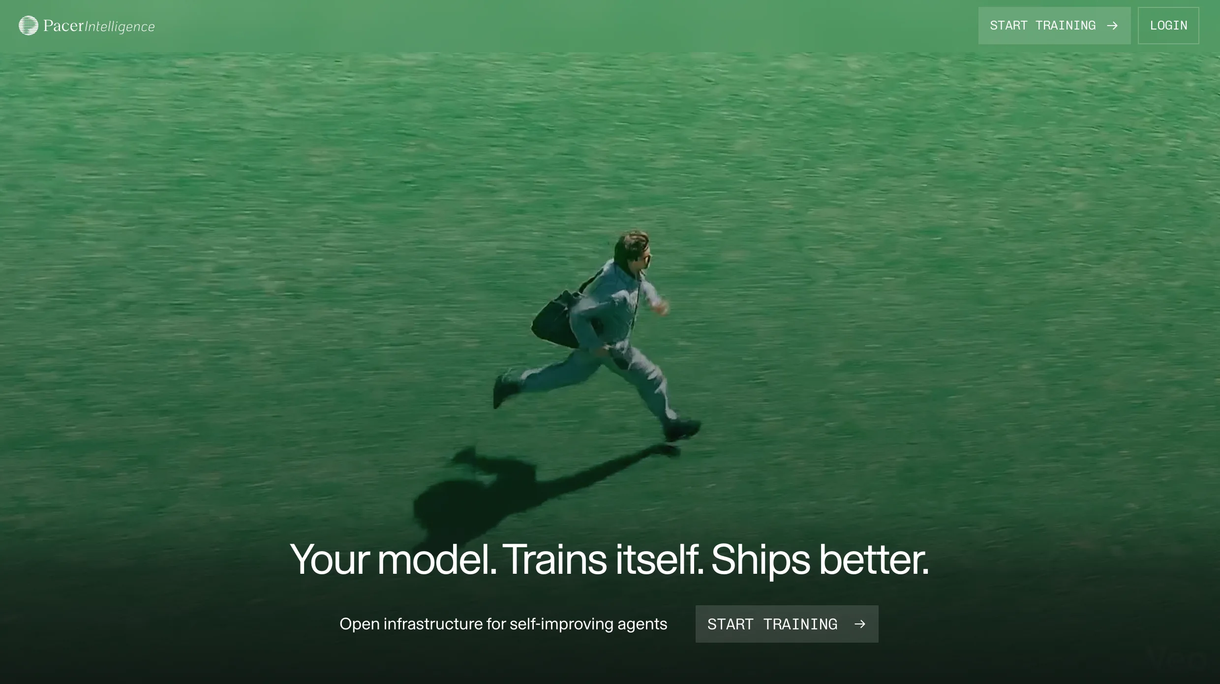
Homepage Is an AI Widget, Not a Landing Page
Score
30
Severity
High
Finding
The homepage renders as an interactive AI assistant prompt widget — 'Your family's assistant / How can Maple help organize your home today?' — with two suggested prompts ('Plan family activity', 'Make shopping list') and a Continue button. This is a product interaction, not a marketing landing page. A first-time visitor who finds Maple through organic search, a recommendation, or a press mention arrives at an app-like widget rather than a page that explains what Maple is, who it's for, what it does, what it costs, or why it's better than Cozi or Google Calendar. The raw HTML confirms the entire page below this widget is just footer navigation and two images.
Recommendation
Build a proper marketing landing page at the root URL. The AI assistant widget is a compelling product demo but it should live below a hero that explains the product and earns the scroll: what Maple is, who it's for, what the key features are (calendar, email, meal planning, AI), pricing signal, app store ratings, and press mentions (Washington Post, Vox, USA Today). The existing sub-pages (/calendar, /email, /meal-planner) already do this well — the homepage should serve as the master hub, not a cold-start product interaction.
UX
Homepage Is an AI Widget, Not a Landing Page
Score
30
Severity
High
Finding
The homepage renders as an interactive AI assistant prompt widget — 'Your family's assistant / How can Maple help organize your home today?' — with two suggested prompts ('Plan family activity', 'Make shopping list') and a Continue button. This is a product interaction, not a marketing landing page. A first-time visitor who finds Maple through organic search, a recommendation, or a press mention arrives at an app-like widget rather than a page that explains what Maple is, who it's for, what it does, what it costs, or why it's better than Cozi or Google Calendar. The raw HTML confirms the entire page below this widget is just footer navigation and two images.
Recommendation
Build a proper marketing landing page at the root URL. The AI assistant widget is a compelling product demo but it should live below a hero that explains the product and earns the scroll: what Maple is, who it's for, what the key features are (calendar, email, meal planning, AI), pricing signal, app store ratings, and press mentions (Washington Post, Vox, USA Today). The existing sub-pages (/calendar, /email, /meal-planner) already do this well — the homepage should serve as the master hub, not a cold-start product interaction.
SEO
Homepage Has Near-Zero Crawlable Content
Score
25
Severity
High
Finding
The crawlable HTML of the homepage contains fewer than 100 words of indexable text: a page title, a headline ('Your family's assistant'), two suggested prompts, one App Store quote, and footer links. All product content, feature descriptions, social proof, and CTAs are either JavaScript-rendered or absent entirely. Google can render JavaScript but the homepage provides almost nothing to index: no H2s, no feature descriptions, no pricing, no customer testimonials beyond one anonymous quote. For a consumer app competing on 'family organizer', 'family calendar app', 'meal planner for families' — all high-volume searches — a homepage with no crawlable content is leaving substantial organic acquisition on the table.
Recommendation
Add statically-rendered hero copy, feature bullets, app store ratings, and at minimum 300-500 words of indexable content to the homepage HTML. The blog already generates excellent SEO content (the /vs/ comparison posts for Cozi, Google Calendar, Notion, Hearth Display are smart). The homepage itself needs to anchor that topical authority with crawlable on-page content targeting 'family organizer app', 'shared family calendar', and 'family meal planner' — the primary acquisition keywords.
Copy
No Value Proposition Above the Fold
Score
35
Severity
High
Finding
A parent who has never heard of Maple arrives at the homepage and sees: a logo, 'Log in / Download app' buttons, the headline 'Your family's assistant', and two prompt chips. There is no sub-headline explaining what Maple is, no feature list, no 'shared calendar + meal planning + email in one app' summary, no pricing signal, and no app store rating. The product's actual positioning — 'reduces the mental load for working parents, all-in-one family hub' — is entirely invisible above the fold. The single testimonial ('A must-have for busy families') is anonymised as 'App Store Reviewer' with no star rating, no name, no context.
Recommendation
Add a sub-headline immediately below 'Your family's assistant' that communicates the core product promise in one sentence: 'Shared calendar, meal planning, email, and to-dos — everything your family needs in one place.' Follow with three icon+text feature bullets. The /calendar and /meal-planner sub-pages do this well and already convert; replicate that structure on the homepage. The AI widget can remain as a secondary interaction after the value prop is established.
Brand
Press Coverage — Invisible on Homepage
Score
42
Severity
Medium
Finding
Maple earned significant press coverage in 2025: Washington Post, Vox Media, USA Today, The Walrus, The Globe and Mail. Apple named it App of the Day four times, including once worldwide. These are extraordinary trust signals for a consumer app — Apple App of the Day is particularly powerful because it signals editorial quality, not just marketing spend. None of this appears on the homepage. The blog's '2025 in Review' post mentions these achievements but a parent who does not read the blog never discovers them.
Recommendation
Add a 'As seen in' press logo strip to the homepage: Washington Post, Vox, USA Today, with Apple 'App of the Day' as a centrepiece badge. The Apple App of the Day (worldwide) is a top-3 trust signal for any iOS app — it communicates that Apple's editorial team independently selected Maple as the best app on the planet on that day. A parent evaluating Maple vs. Cozi who sees this signal will convert at a significantly higher rate. Position this strip immediately below the hero, above any feature content.
Structure
Help Center Links to External Notion Page
Score
45
Severity
Medium
Finding
The Help Center link in the footer and nav routes to a public Notion page (cyan-paradox-693.notion.site/Maple-Help-Center-...) rather than a hosted help center on the growmaple.com domain. This is a common early-stage shortcut but creates three problems: (1) it breaks brand continuity as users land on Notion's interface, (2) the Notion URL contains 'cyan-paradox-693' — a meaningless identifier — rather than any Maple branding, and (3) it suggests the help content is informal and unfinished to users arriving for support. For a consumer app handling family data and charging Maple+ subscribers, a Notion page as the support destination looks underpowered.
Recommendation
Migrate the help center to an on-domain solution — Intercom, Help Scout, Notion's custom domain feature, or even a simple /help subdomain with static pages. At minimum, use Notion's custom domain mapping to serve the content at help.growmaple.com rather than a public Notion workspace URL. For subscribers paying $3-5/month, a professional help centre signals that support quality matches the subscription value.
Freshness
Footer Copyright Inconsistency — 2025 and 2026 Both Present
Score
38
Severity
Low
Finding
The homepage footer shows '© 2025 Maple' in one location and '© 2026 Maple' in another — both appear in the same rendered page. The calendar sub-page footer also shows '© 2025 Maple'. For a consumer app, an inconsistent or stale copyright year in the footer is a small but visible signal of under-maintained web infrastructure. Parents evaluating an app to manage their family's data notice these details.
Recommendation
Update all footer copyright instances to '© 2026 Maple' and automate the year value in the site build template so it never falls stale. Audit all sub-pages (/calendar, /email, /meal-planner) for the same inconsistency. This is a 30-minute fix that removes a credibility friction point entirely.
UX
Navigation — Features and Pricing Not in Primary Nav
Score
48
Severity
Medium
Finding
The homepage nav contains only: 'Log in' and 'Sign up / Download app.' The Calendar, Email, Meal Planner, and Maple+ (pricing) links are absent from the homepage nav — they appear on sub-pages but not on the homepage itself. A first-time visitor cannot navigate to pricing, features, or the app download from the primary nav without first clicking into the AI assistant interaction. The footer nav has Solutions links (Calendar, Email, Meal Planner, Maple+), but footer navigation is not primary navigation for acquisition-intent visitors.
Recommendation
Add full navigation to the homepage: Solutions (Calendar, Email, Meal Planning, AI Assistant), Plans/Pricing, Blog, Download. A clean nav with five items and a 'Download free' CTA is the standard for consumer apps in this category. Cozi, which Maple directly compares itself to, has a complete nav on every page — feature discovery through navigation is a meaningful conversion driver for parents who arrive knowing they need a family app but not knowing which specific Maple feature will close them.
Performance
JavaScript-Heavy Homepage — No Static Fallback
Score
40
Severity
Medium
Finding
The homepage is almost entirely JavaScript-rendered — the entire product widget (the AI assistant, prompt chips, images, CTA) is non-existent in the raw HTML and requires JS execution to appear. For a consumer app targeting busy parents who are often on mid-tier mobile devices, a homepage that relies entirely on JavaScript for its primary content creates a real risk of a blank-screen or loading state experience on slower connections. The Webflow-hosted sub-pages (Calendar, Meal Planner) use static HTML with .avif images and render independently of JS — demonstrating that the static approach is viable for the product.
Recommendation
Pre-render or statically generate the homepage hero content so that the value proposition, CTA, and app store links are visible in the initial HTML response — before JavaScript executes. This ensures Google can index the content, screen readers can access it, and users on slow connections see something meaningful immediately. The AI assistant widget can hydrate after the static content is visible. This is a standard progressive enhancement pattern — static shell, JS enhancement.
Social Proof
App Store Ratings — Not Displayed on Homepage
Score
50
Severity
Medium
Finding
Maple has an Apple App Store presence strong enough to be named App of the Day four times in 2025. The Google Play listing describes it as an 'AI Assistant for busy parents.' Yet the homepage displays only one anonymised App Store quote with no star rating, no review count, and no App Store badge. For a consumer app where purchase decision is heavily influenced by peer review signals, the absence of explicit star ratings ('4.8 stars · 10,000+ reviews') is a conversion miss. The one testimonial present ('A must-have for busy families — App Store Reviewer') could be from any anonymous account.
Recommendation
Add App Store and Google Play rating badges with star count to the homepage hero — 'Available on iOS and Android' with live-rendered star ratings if possible, or static as of a recent date. Add 3-4 named, attributed testimonials (first name + family description, e.g. 'Sarah M., mom of 3') with star ratings. The App of the Day achievement from Apple specifically deserves its own visual treatment — it's a form of editorial endorsement from the world's most trusted consumer technology platform.
Structure
Pricing Page — Discovery Requires Knowing the URL
Score
44
Severity
Medium
Finding
Maple+ pricing ($3-5/month depending on plan) exists at /plans but this page is not linked from the homepage nav, the homepage hero, or any above-fold element on the homepage. The only way to find pricing from the homepage is to: notice the footer link to 'Maple+', or navigate to a sub-page where the nav includes it. For a subscription consumer app, pricing visibility is a conversion driver — parents evaluating whether to download Maple want to know the cost before installing. Burying pricing requires a user to already trust the product enough to explore the site, rather than letting pricing be part of the initial trust-building.
Recommendation
Add 'Plans & Pricing' to the primary homepage navigation and include a pricing signal in the hero or below it: 'Free to download · Maple+ from $3/month.' The freemium model is a conversion asset — knowing the app is free to try removes the primary objection for skeptical parents. Making this visible above the fold converts the pricing question from a barrier into an invitation.
Frequently asked
Frequently asked
What kind of companies do you work with?
What does a typical project look like?
We've had bad experiences with agencies before. What's different?
Why Framer over other platforms?
How do we get started?
How does pricing work?


V7 Labs


Utila


Buena


Enzai


Centific


trawa


Echo


Portex Global


Othello AI

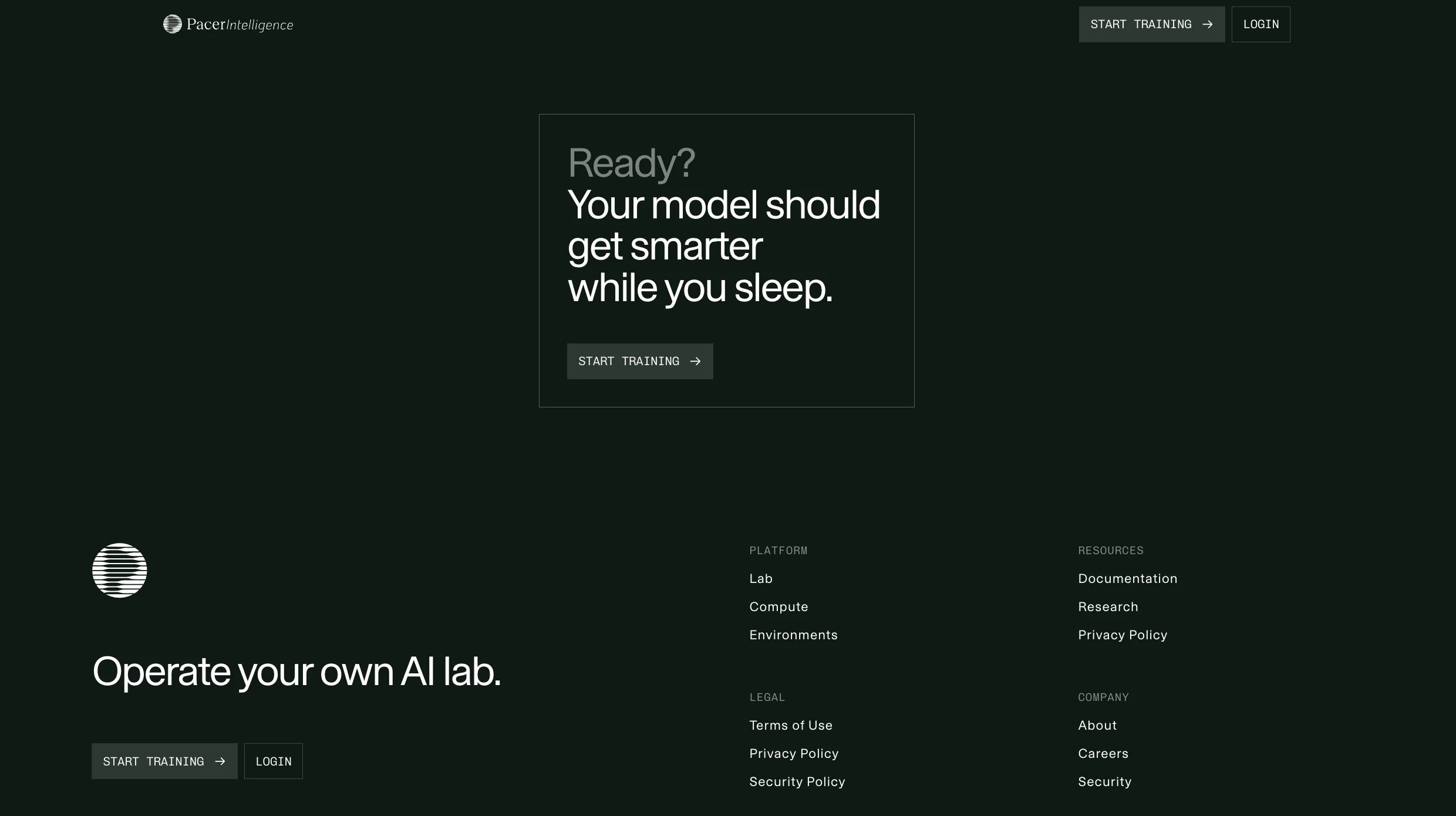
Pacer Intelligence


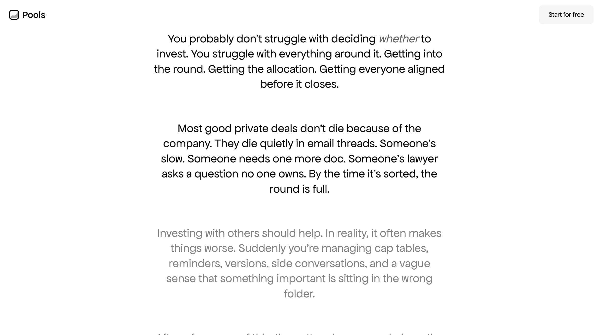

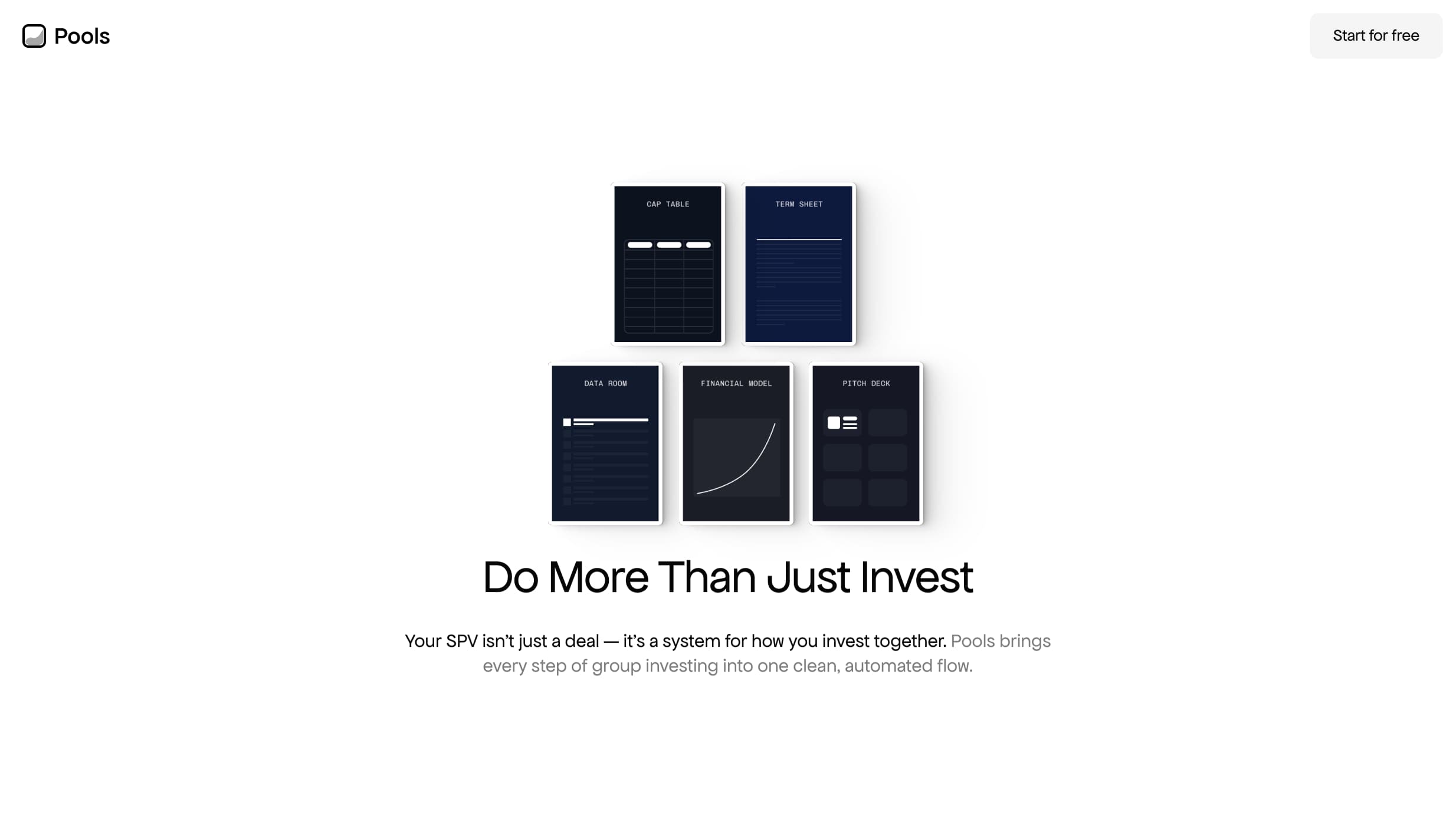

Pools
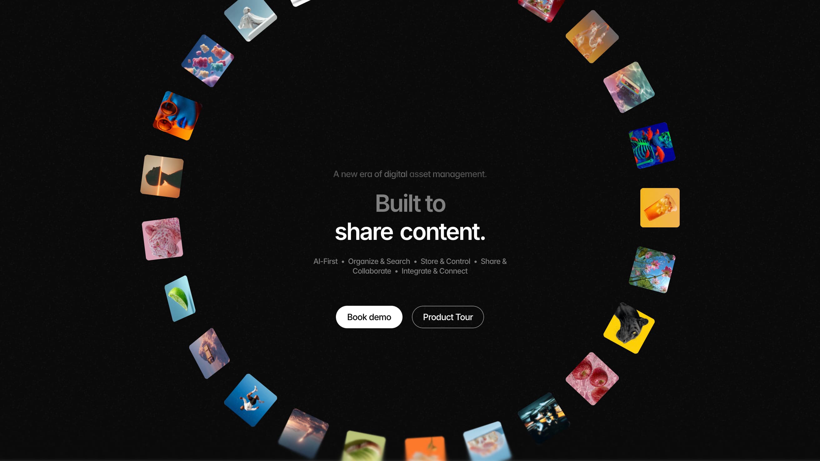


Contentcloud