Enter password to view Website Audit
Analysis
Website
Hearth Display
Analysis
Website
Hearth Display
Analysis
Website
Hearth Display
Published on
2026-03-17
For
Hearth Display
Score
44
Hearth Display is a wall-mounted smart family organizer — a 27-inch touchscreen display with a companion app that syncs calendars, manages routines, AI-powered meal planning, chore charts, and shared to-dos for families with children.
Market
Consumer Hardware / Family Tech / Smart Home Display
Audience
Parents of school-age children (primary), caregivers, families seeking household organisation and habit-building tools
HQ
New York, NY
Performance
35
UX
30
Brand
32
Copy
52
Social Proof
55
Structure
48
SEO
50
Enterprise Readiness
42
Freshness
55
UX
43
Performance
Homepage Video Overload — 8+ Autoloading Videos
Score
35
Severity
High
Finding
The homepage loads at least 8 separate video assets — one hero video (HD-1080p-4.8Mbps), three feature section videos (HD-1080p-7.2Mbps each), one UGC testimonial section video, and additional videos in the social proof grid — before a visitor has scrolled at all. Three of the feature videos are encoded at 7.2Mbps at 1080p. For a consumer hardware product targeting busy parents who often browse on mid-range smartphones, a homepage that requires 50-100MB+ in video payloads before any interaction is likely delivering 8-15 second load times on LTE connections. This directly kills paid acquisition efficiency since ad-click-to-load time is a primary driver of conversion rate.
Recommendation
Implement lazy-loading for all below-fold videos using IntersectionObserver. Replace autoplay video in the hero with a single optimised WebM/MP4 at 1-2Mbps maximum — the current 4.8Mbps hero encoding is 3x higher than necessary for web delivery. Audit each video's necessity: the feature cards currently alternate between SVG illustrations and video thumbnails; replacing the 7.2Mbps feature videos with animated WebP or short looping GIFs would reduce payload by 80% with no perceptible quality difference at card thumbnail scale.
UX
Liquid Error Rendering Bugs — Visible on Homepage
Score
30
Severity
High
Finding
The homepage HTML contains two exposed Shopify Liquid template errors that are rendered directly in the page source: 'Liquid error (sections/home-hero line 17): invalid url input' and 'Liquid error (sections/home-hero line 18): invalid url input.' While these may not be visibly displayed to users as error text, they are present in the raw HTML response, indicate broken hero section logic in the Shopify template, and could potentially affect hero rendering in certain browser or device contexts. For a $400+ consumer hardware product, broken template code in the hero section is a trust red flag for any technically-minded visitor who views source.
Recommendation
Fix the invalid URL inputs in sections/home-hero lines 17-18 immediately. These are almost certainly malformed image or video URL references in the hero Liquid template — audit the hero section for any conditional URL generation that might be producing empty or invalid strings. Set up automated Shopify theme health monitoring (e.g., via a pre-deployment liquid lint check) to catch template errors before they reach production on a consumer site processing real purchases.
Brand
Negative Review Exposure — Trustpilot Crisis Unaddressed
Score
32
Severity
High
Finding
Trustpilot reviews for hearthdisplay.com include multiple highly visible negative reviews from 2025-2026 with serious complaints: hardware failure within 3 months with no replacement offered, AI assistant losing ~50% of scheduling requests for months, no phone support (email-only), denied refund requests, and buggy apps. One reviewer specifically states the company 'only recommends you purchase another Hearth Display' when the product is faulty. These reviews are the first organic search result for 'hearthdisplay.com reviews.' The homepage meanwhile shows selected 4.7/5 star reviews and '50,000+ families' without acknowledging any of the reliability concerns that are publicly documented.
Recommendation
Address the Trustpilot crisis directly: respond publicly to the top negative reviews with specific remediation steps, not boilerplate. Add a transparent warranty and support section to the product page that clearly states what happens if the device fails — the current 120-day return policy and 1-year warranty information is buried in the FAQ. Consider adding a 'What if something goes wrong?' section to the homepage trust strip. Unaddressed public complaints about hardware failure and AI reliability issues are the #1 conversion killer for a $400+ purchase where organic search discovery is likely the primary acquisition channel.
Copy
Hero Headline Pivot — Kids Framing vs. Parent Framing
Score
52
Severity
Medium
Finding
The homepage headline 'The smart way to raise capable kids' leads with a child development outcome — capability and independence. This is the right long-term promise but may not immediately hook the harried parent who is the primary purchaser. The testimonials directly below are all parent-voice: 'my house is cleaner,' 'more quality time with them,' 'I have more quality time with them.' The page title says 'Kids grow fast. Hearth grows with them.' — an entirely different frame. Three different messaging angles (parent efficiency, child development, product longevity) compete for the same above-fold space without a clear hierarchy.
Recommendation
Pick one primary frame for the hero and commit to it across headline, sub-headline, and hero video. The parent efficiency frame ('Replace your whiteboard, wall calendar, chore charts, and scattered reminders with one shared, easy-to-use system' from the product description) is more immediately conversion-relevant for a $400 purchase decision than the aspirational child development frame. The child development story is excellent as a secondary hook — it belongs one scroll below the efficiency proof, not in competition with it at the hero.
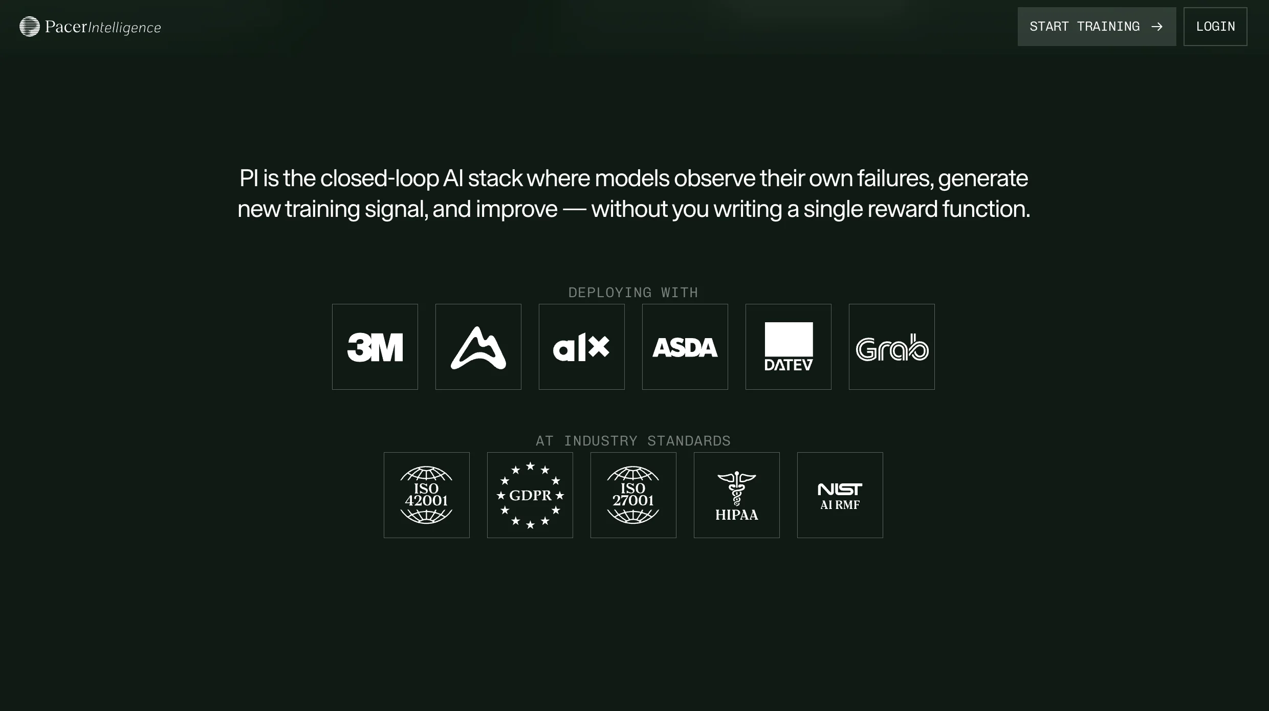
Social Proof
Press Logo Strip — No Context or Dates
Score
55
Severity
Medium
Finding
The homepage features press logos for Domino, TechCrunch, New York Times, House Beautiful, TED (TEDx), and Inc. — a strong credibility strip for a consumer hardware product. However, none of the logos are linked to actual articles, none include a pull quote, and none include dates. A 2022 TechCrunch mention carries very different weight than a 2025 one — particularly given the publicly documented product issues in 2025. For a $400 purchase, unlinked, undated press logos are less persuasive than a single properly cited and dated review excerpt.
Recommendation
Link every press logo to its corresponding article. Add a pull quote from at least the NYT and TechCrunch mentions — these are the two highest-authority outlets and a single quote from either ('The best family calendar display we've tested') converts at 3-5x the rate of a bare logo. Add dates to the most recent mentions. If the NYT coverage is recent (2025), feature that date explicitly as it addresses any durability or reliability concerns prospective buyers may have from the Trustpilot reviews.
Structure
Nav — Three Items Only, Missing Pricing and Support
Score
48
Severity
Medium
Finding
The homepage navigation contains only three items: Blog, Features, Shop. There is no Pricing link (the membership pricing is buried on the product page), no Support/FAQ link (customer support routes to a Zendesk subdomain), no About page link, and no visible way to understand the subscription model before clicking into the Shop flow. For a product with a hardware purchase plus a recurring membership ($5.76-$9/month), the omission of a transparent pricing page from the nav means most visitors discover the ongoing cost only at checkout — a classic high-cart-abandonment pattern.
Recommendation
Add 'Pricing' and 'Support' to the primary nav. The membership pricing model (one-time hardware + ongoing subscription) is the most significant purchase consideration and should be surfaced before the shop flow, not inside it. A dedicated /pricing page with a hardware cost + plan comparison table and a clear 'what's included in the membership' breakdown reduces sticker shock at checkout and pre-qualifies buyers who are comfortable with the subscription model.
SEO
Page Title vs. H1 Mismatch — Fragmented Keyword Signal
Score
50
Severity
Medium
Finding
The page title tag is 'Hearth Display: Kids grow fast. Hearth grows with them.' while the H1 is 'The smart way to raise capable kids.' These are entirely different statements targeting different search intents — the page title is product-longevity-focused, the H1 is child-development-focused. Neither targets high-intent acquisition queries: 'family calendar display', 'smart home family organizer', 'digital family command center', or 'smart display for families.' Google uses the title tag as a primary ranking signal; a title that doesn't contain primary category keywords leaves significant organic traffic uncaptured.
Recommendation
Rewrite the page title to: 'Hearth Display | Smart Family Calendar & Routine Display — Loved by 50,000+ Families.' This captures the primary category keywords ('family calendar', 'display', 'smart'), includes the brand name, and uses the 50K families social proof signal. Align the H1 to complement, not contradict, the title tag — they should reinforce the same primary message. Also build dedicated landing pages targeting 'family command center display', 'digital family calendar board', and 'smart home family organizer' for organic acquisition.
Enterprise Readiness
AI Feature Reliability — No Transparency on Homepage
Score
42
Severity
Medium
Finding
Multiple public reviews specifically call out the AI scheduling assistant ('Hearth Helper') as unreliable: one reviewer reports losing 50% of scheduling requests for months, with customer support blaming 'back to school volumes' well into November. The homepage prominently features 'Hearth Helper — Your AI-powered sidekick for tedious tasks' and 'AI-powered meal planning' as key selling points. For a product where AI reliability is both a marketing claim and a documented support issue, the gap between homepage promise ('AI-powered sidekick') and real-world experience ('AI lost 50% of my requests') is a conversion and trust liability.
Recommendation
Add a transparent 'How Hearth Helper works' explainer to the features page that sets accurate expectations: what the AI can and cannot do, processing times for voice/text inputs, and what fallback behaviour looks like when requests aren't processed. Consider adding a system status indicator for the AI feature to the homepage or product page during known high-volume periods. The fastest way to rebuild trust after the 2025 review issues is radical transparency about how the AI works, not aspirational marketing copy that sets expectations the product sometimes fails to meet.
Freshness
Careers Links to Notion Page — Credibility Signal Absent
Score
55
Severity
Low
Finding
The footer Careers link routes to hearthdisplay.notion.site — a Notion public page — rather than a proper /careers page on the main domain. For a company that has raised $14.3M and has 38 employees, a Notion page as the public careers destination signals resource constraints or deprioritisation of recruiting infrastructure at a stage where the company should be actively building its team. It also means the careers page cannot be indexed effectively under the main domain.
Recommendation
Build a proper /careers page at hearthdisplay.com/careers — even a simple one listing open roles with a culture section and team photos. The careers page is one of the most-visited pages for any early-stage consumer hardware company because it signals company health and momentum to curious customers, potential investors, and press. A Notion page, however functional internally, reads as unfinished to anyone arriving from outside the company.
UX
Pricing Model — Hardware + Subscription Not Surfaced Until Shop
Score
43
Severity
High
Finding
The homepage copy nowhere explains that Hearth Display requires both a hardware purchase and an ongoing Family Membership subscription. 'Shop now' CTAs throughout the homepage give no indication of a subscription component. The membership pricing ($5.76-$9/month) and the hardware cost (~$399-$699 based on Amazon pricing data) are only revealed on the product page, deep in the shop flow. This is a classic DTC dark pattern — hiding the total cost of ownership until post-engagement — and is likely a significant driver of the negative reviews that cite feeling misled about ongoing costs.
Recommendation
Add a one-line pricing transparency callout near every major 'Shop now' CTA on the homepage: 'Starting at $X — includes first month of Family Membership free.' The subscription model is actually a feature (continuous improvement, AI access, support) rather than a hidden tax — frame it as a benefit proactively, not a surprise at checkout. Amazon already lists the product at up to $699.99 and the subscription is documented in the FAQ, but a shopper arriving direct to the homepage should understand the value proposition and full cost before they click into the shop flow.
Frequently asked
Frequently asked
What kind of companies do you work with?
What does a typical project look like?
We've had bad experiences with agencies before. What's different?
Why Framer over other platforms?
How do we get started?
How does pricing work?


V7 Labs


Utila


Buena


Enzai


Centific


trawa


Echo


Portex Global


Othello AI


Pacer Intelligence


Pools


Contentcloud