Enter password to view Website Audit
Analysis
Website
Quentic (an AMCS company)
Analysis
Website
Quentic (an AMCS company)
Analysis
Website
Quentic (an AMCS company)
Published on
2026-03-18
For
Quentic (an AMCS company)
Score
48
Quentic is a modular, cloud-based SaaS platform for EHS (Environment, Health & Safety) and ESG management, serving 1,000+ customers across manufacturing, chemicals, automotive, utilities, and other industrial sectors. Part of AMCS Group. Named a Verdantix Leader in both EHS Software and ESG & Sustainability Reporting Software (2025). Supports ISO 45001, ISO 14001, ISO 27001, ISO 9001, ISO 50001, CSRD/ESRS, GRI, and CDP compliance.
Market
EHS Management Software / ESG & Sustainability Reporting / EHSQ SaaS / Industrial Compliance Software
Audience
Head of EHS / HSE Director, Sustainability Manager, Environmental Manager, EHS Software Evaluators — at mid-size to large industrial enterprises across Europe and globally
HQ
Berlin, Germany
Copy
45
Performance
38
Brand
50
Copy
44
Navigation
48
Copy
52
Social Proof
42
Freshness
55
SEO
48
Navigation
58
Copy
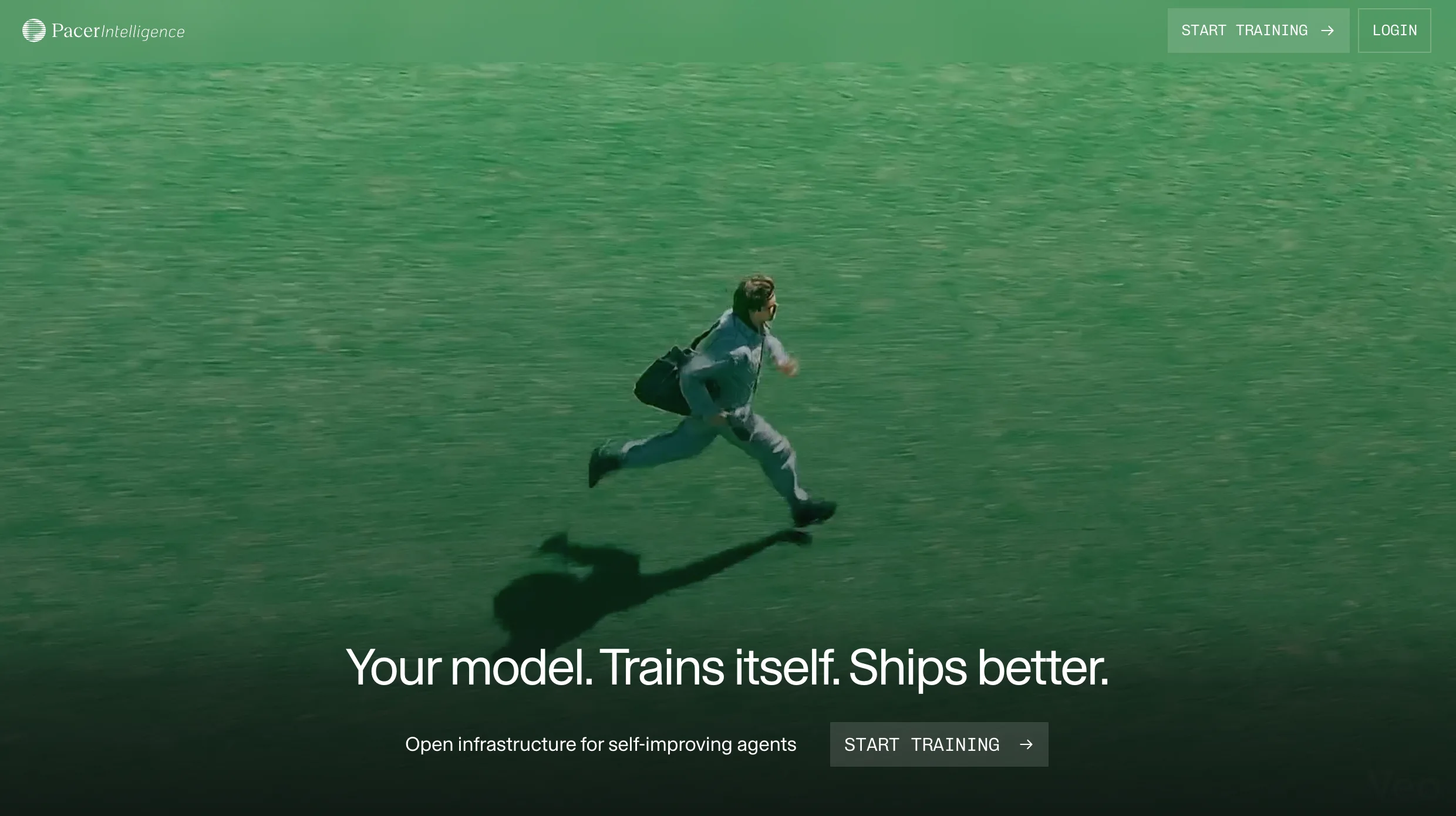
Hero H1 Abstracts the Actual Value Proposition
Score
45
Severity
High
Finding
The hero H1 reads: 'EHS & ESG: United in one AI-enabled software.' This is a product category description, not a value proposition. The sub-headline ('Quentic delivers superior compliance, safer workplaces, and change-making environmental data, paving the way for a more sustainable future') is similarly generic — 'superior compliance' and 'safer workplaces' are what every EHS software claims. Nothing in the hero tells a Head of EHS at a manufacturing company what specifically makes Quentic different from Intelex, Cority, or any other platform. The AMCS parent company context — which implies global scale, integration with waste/resource management software, and enterprise-grade infrastructure — is invisible above the fold. Verdantix Leader status for both EHS and ESG is buried in a scrolled certification strip.
Recommendation
Rewrite the H1 to lead with the concrete business outcome, not the product architecture: e.g. 'Stay compliant, stay safe — EHS and ESG in one platform trusted by 1,000+ companies worldwide.' Or sharpen to the unique positioning angle: 'The only EHS & ESG platform that's a Verdantix Leader in both — for mid-size to global enterprise.' Test a version that names the CSRD/regulatory urgency (a genuine buying trigger in the European market right now) in the hero itself, not buried in a use-case page. The sub-headline should answer 'why Quentic vs. the alternatives' in one sentence.
Copy
Hero H1 Abstracts the Actual Value Proposition
Score
45
Severity
High
Finding
The hero H1 reads: 'EHS & ESG: United in one AI-enabled software.' This is a product category description, not a value proposition. The sub-headline ('Quentic delivers superior compliance, safer workplaces, and change-making environmental data, paving the way for a more sustainable future') is similarly generic — 'superior compliance' and 'safer workplaces' are what every EHS software claims. Nothing in the hero tells a Head of EHS at a manufacturing company what specifically makes Quentic different from Intelex, Cority, or any other platform. The AMCS parent company context — which implies global scale, integration with waste/resource management software, and enterprise-grade infrastructure — is invisible above the fold. Verdantix Leader status for both EHS and ESG is buried in a scrolled certification strip.
Recommendation
Rewrite the H1 to lead with the concrete business outcome, not the product architecture: e.g. 'Stay compliant, stay safe — EHS and ESG in one platform trusted by 1,000+ companies worldwide.' Or sharpen to the unique positioning angle: 'The only EHS & ESG platform that's a Verdantix Leader in both — for mid-size to global enterprise.' Test a version that names the CSRD/regulatory urgency (a genuine buying trigger in the European market right now) in the hero itself, not buried in a use-case page. The sub-headline should answer 'why Quentic vs. the alternatives' in one sentence.
Performance
Stats Counter Renders as Zeros on Page Load
Score
38
Severity
High
Finding
The homepage contains a prominent 'A unified, AI-enabled system' stats section with four counters — customers, countries, employees, years of expertise — all of which render as literal '0' in the fetched page source: '0customers / 0countries with Quentic users / 0employees / 0years of expertise'. This is a JavaScript-animated counter that requires JS execution to populate real values. For any visitor whose browser has JS disabled, any crawler, any social media preview scraper, and any accessibility tool using a screen reader, this section presents as four zeros. It also means the page source that Google indexes may contain zeros rather than the actual figures (900+ customers per third-party listings, 300+ employees, 18 years). This is one of the most avoidable credibility-destroying bugs a SaaS homepage can ship.
Recommendation
Replace the JS-animated counter approach with server-side rendered static numbers using CSS animation for the count-up effect. The actual values (1,000+ customers, 30+ countries, 300+ employees, 18+ years) must be present in the HTML source as real text nodes — not populated dynamically post-load. This is both a Google indexing issue and an accessibility failure. The numbers are among Quentic's most important trust signals; rendering them as zeros by default is the equivalent of leaving your testimonials section blank. Audit all other JS-dependent social proof elements on the page for the same issue.
Brand
AMCS Parent Company Relationship Ambiguous — Trust Signal Buried
Score
50
Severity
High
Finding
The footer reads 'Quentic (an AMCS company)' with a linked AMCS logo — the only mention of the parent company on the entire homepage. AMCS Group is the world's leading provider of integrated software for the waste, recycling, and resource management industry, with significant enterprise scale and global presence. For EHS and ESG buyers, knowing that Quentic is backed by a profitable, large-scale enterprise software group provides major vendor-risk reassurance — especially relevant given that competitors like Intelex are also now part of large groups (Fortive). The current treatment relegates a powerful credibility signal to a footer logo that most visitors will never see, while the body of the homepage reads like a standalone startup.
Recommendation
Bring the AMCS parent context into the homepage trust narrative — not as a footnote but as a proof point: 'Part of AMCS Group — powering EHS and resource management for enterprises across 23+ countries.' This signals financial stability, enterprise-grade infrastructure, and long-term product investment to procurement committees and IT security reviewers who specifically evaluate vendor viability. For the European manufacturing and utilities segments that Quentic serves, AMCS Group's established reputation in waste and resource management is directly relevant — many customers will already have AMCS touchpoints.
Copy
Customer Logo Strip — Eight German-Centric Logos With No Tier-1 Global Names
Score
44
Severity
Medium
Finding
The homepage customer logo strip shows: UL International TTC GmbH, BayWa AG, ZF Friedrichshafen AG, Hermes Fulfilment GmbH, Apleona HSG GmbH, Vattenfall Europe Information Services GmbH, GEA Refrigeration Germany GmbH, AREVA GmbH. Every single logo is a German or Germany-division entity. While Quentic claims 1,000+ customers across 30+ countries, the social proof strip tells a story of a German mid-market product — not a global enterprise EHS platform. The success stories section does include Pirelli, Siemens Schweiz, INEOS Köln, and Voith — brands with genuine global recognition — but none of these appear in the homepage logo strip, which is the highest-visibility trust signal on the page.
Recommendation
Redesign the homepage logo strip to lead with the most globally recognisable names: Pirelli, Siemens, INEOS, Voith, ZF Friedrichshafen. Replace the division-entity nameplates (e.g. 'GEA Refrigeration Germany GmbH') with parent brand logos where possible. If global enterprise logos are not available or not customers, reconsider whether the logo strip should be segmented by industry vertical (automotive, chemicals, utilities) to reinforce the cross-sector credibility story. Eight nearly identical German GmbH logos communicate 'regional German software' rather than 'the leading EHS platform for global enterprises.'
Navigation
Primary Nav Has No 'Pricing' Link — Demo Is the Only Conversion Path
Score
48
Severity
Medium
Finding
The primary navigation contains: Software, Solutions, References, Services, Resources — and a top-right 'Demo' CTA. There is no pricing page, no pricing link, and no self-serve trial path. In 2026, B2B SaaS buyers across the mid-market segment that Quentic explicitly targets ('medium-sized companies to large corporations') expect to find at minimum a pricing page that communicates tier structure and starting price ranges — even if exact pricing requires a demo. The complete absence of any pricing signal forces every potential customer into a demo funnel before they can determine basic budget fit, adding significant friction and likely driving many mid-market EHS managers away before they ever engage.
Recommendation
Add a /pricing page that communicates at minimum: the modular pricing model (pay for modules selected), the general price positioning (e.g. 'starting from X per user per month'), and the distinction between SMB and enterprise tiers. If exact pricing cannot be published, use a 'Get a quote' approach with a transparent 'What affects pricing' FAQ that covers number of users, module selection, and implementation complexity. This pricing page itself has significant SEO value for queries like 'Quentic pricing', 'EHS software cost', 'EHSQ software pricing' — queries with strong commercial intent that the site currently cannot capture.
Copy
Sub-Navigation 'Get people excited' Pillar — Tone Mismatch for EHS Buyers
Score
52
Severity
Medium
Finding
The homepage features four benefit pillars below the hero image: 'Take data-driven action', 'Connect every stakeholder', 'Get people excited', and 'Lean on proven standards'. The third pillar — 'Get people excited' — reads as tone-deaf for the primary EHS buyer persona. EHS managers, HSE Directors, and Sustainability Officers are not trying to 'get people excited' about safety software; they are trying to ensure regulatory compliance, reduce incident rates, avoid fines, and demonstrate CSRD readiness to their board. 'Get people excited' is marketing copy borrowed from consumer apps and lands awkwardly in a context where the consequences of EHS failures include workplace deaths and regulatory enforcement.
Recommendation
Replace 'Get people excited' with a pillar that reflects the actual EHS buyer motivation: 'Drive adoption across every site' or 'Make compliance second nature' or 'Build a safety-first culture' — all of which communicate the same feature benefit (ease of use, employee-level adoption) without the consumer-app register. The rest of the pillar description ('Made by experts, for experts, we offer tools tailored to your needs') is perfectly appropriate — just the heading needs to match the professional severity of the buyer context. Review all homepage copy for similar tone mismatches between consumer-friendly language and the actual stakes of EHS management.
Social Proof
No Customer Quotes or Quantified Outcomes on Homepage
Score
42
Severity
Medium
Finding
The homepage contains a customer logo strip and a 'See our references' link, but zero customer quotes or quantified outcome statements above the fold or anywhere on the main homepage scroll. The success stories section exists as a separate page, and the nav links to it, but the homepage itself surfaces no voice-of-customer content. Third-party review content is available — Capterra and GetApp reviews mention specific outcomes — and the VISIONS 2025 event produced customer stories. For EHS software buyers who are comparing 4-6 vendors simultaneously, a homepage without a single attributed customer quote forces them to navigate away to find social proof rather than receiving it passively during their evaluation visit.
Recommendation
Add a testimonial section to the homepage with 3-4 attributed customer quotes that each include a quantified business outcome: reduction in incident rate, time saved on audit preparation, number of locations managed, CSRD compliance readiness achieved. The success story format already exists (Pirelli: 'Certified safety all round', Siemens Schweiz: 'Digitally to world-class quality') — extract the headline metric from each into a homepage quote card. Even a single quote from a globally recognised customer (Pirelli, Siemens) with a specific number ('reduced audit preparation time by 40%') would dramatically increase mid-funnel conversion for first-time visitors.
Freshness
News Section — Most Recent Item Is January 2026, Three Items Are 2025
Score
55
Severity
Low
Finding
The homepage news section shows four items: January 22 2026 (AI capabilities), January 13 2026 (Control of Work), October 2025 (VISIONS 2025), April 2025 (Health and Safety report). Two of four homepage news items are from 2025, and the most recent real product news item is from January 2026 — now two months stale. For an EHS software platform in a rapidly evolving regulatory environment (CSRD enforcement, UK SRS implementation, CS3D timelines), being perceived as slow to publish signals either low product velocity or low content investment. The April 2025 item about a report has been on the homepage for nearly a year.
Recommendation
Establish a homepage news section rotation policy: no item older than 90 days should appear in the homepage news strip. The January 2026 AI capabilities announcement is strong — but it needs fresher companions. The regulatory calendar for 2026 is full of content opportunities: CSRD first-wave reporting deadlines (April 2026 for large PIEs), UK SRS consultation updates, EU PFAS restrictions affecting hazardous chemicals customers. Publish 2-4 short news items per month and surface the most recent three on the homepage. The 'Safety Management and Sustainability Trends Report 2026' banner at the very top of the page is well-timed — the news section should match that editorial urgency.
SEO
Page Title Tag Mismatch — 'EHS & sustainability' vs 'EHS & ESG'
Score
48
Severity
Low
Finding
The page title is 'The leading software for EHS & sustainability' while the homepage H1 reads 'EHS & ESG: United in one AI-enabled software.' These use different terminology for the same product capability. 'ESG' and 'sustainability' are not synonymous in buyer language: ESG is a reporting and governance framework (used by CFOs, investor relations teams, and board-level sustainability officers), while 'sustainability' is a broader operational term (used by environmental managers and operations teams). The title tag inconsistency means the page is potentially competing against itself in search — or failing to capture either the 'EHS ESG software' or 'EHS sustainability software' query cohort as effectively as it should.
Recommendation
Align the page title tag, H1, meta description, and all primary CTAs around a single terminology standard. Given Quentic's Verdantix Leader status in both EHS Software and ESG & Sustainability Reporting, the strongest title tag would be: 'Quentic | EHS & ESG Software — Verdantix Leader 2025 | Safety, Compliance & Sustainability.' This captures both query cohorts, leads with the analyst recognition, and differentiates from generic category titles. Conduct keyword research to determine whether 'EHS ESG software', 'EHSQ software', or 'sustainability management software' drives higher commercial-intent volume in the DACH and UK markets that represent Quentic's primary revenue base.
Navigation
Top Nav Inconsistency — 'Demo' Appears in Both Top Bar and Primary Nav
Score
58
Severity
Low
Finding
The navigation renders 'Demo' as a standalone top-bar link in the utility nav (alongside Login and language selector) AND as a sub-item under 'Services > Experience Quentic > Demo'. The main body has a 'Get a demo' CTA button in the hero. This means 'Demo' appears in at least three distinct locations on the page — the utility nav, the Services mega-menu, and the hero button — without hierarchy. Meanwhile, 'Contact us' appears as a floating banner at the top and in the footer, but not in the primary nav. The result is a navigation architecture where the two most important conversion actions (Demo and Contact) are scattered across the page rather than having clear, singular placement.
Recommendation
Consolidate the primary conversion CTA to a single, prominent 'Get a demo' button in the top-right nav bar (replacing the current standalone 'Demo' text link). Remove 'Demo' from the Services sub-menu — this creates a secondary, buried path to the same destination that dilutes the primary CTA. Add 'Pricing' as a primary nav item between 'References' and 'Services' to give self-directed buyers a direct path to pricing information without requiring a demo interaction first. The floating 'Contact us' banner should be evaluated for removal — it covers page content and competes with the hero CTA.
Frequently asked
Frequently asked
What kind of companies do you work with?
What does a typical project look like?
We've had bad experiences with agencies before. What's different?
Why Framer over other platforms?
How do we get started?
How does pricing work?


V7 Labs


Utila


Buena


Enzai


Centific


trawa


Echo


Portex Global


Othello AI
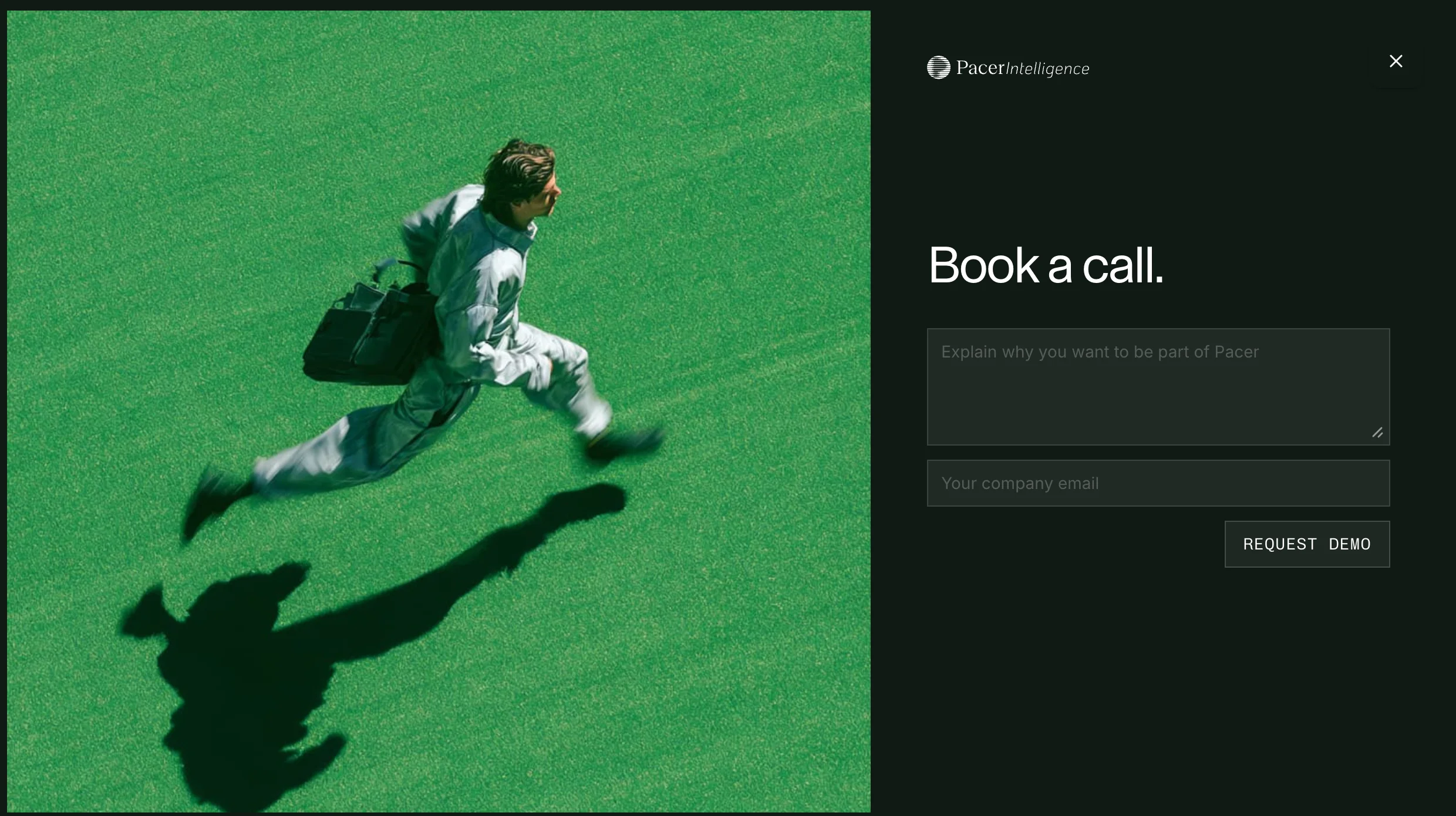
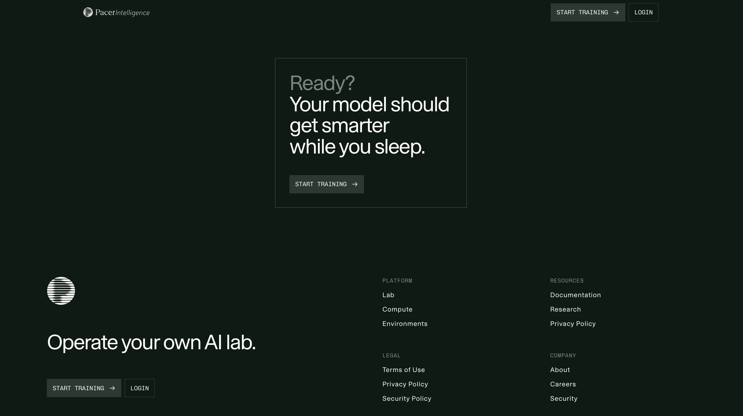
Pacer Intelligence


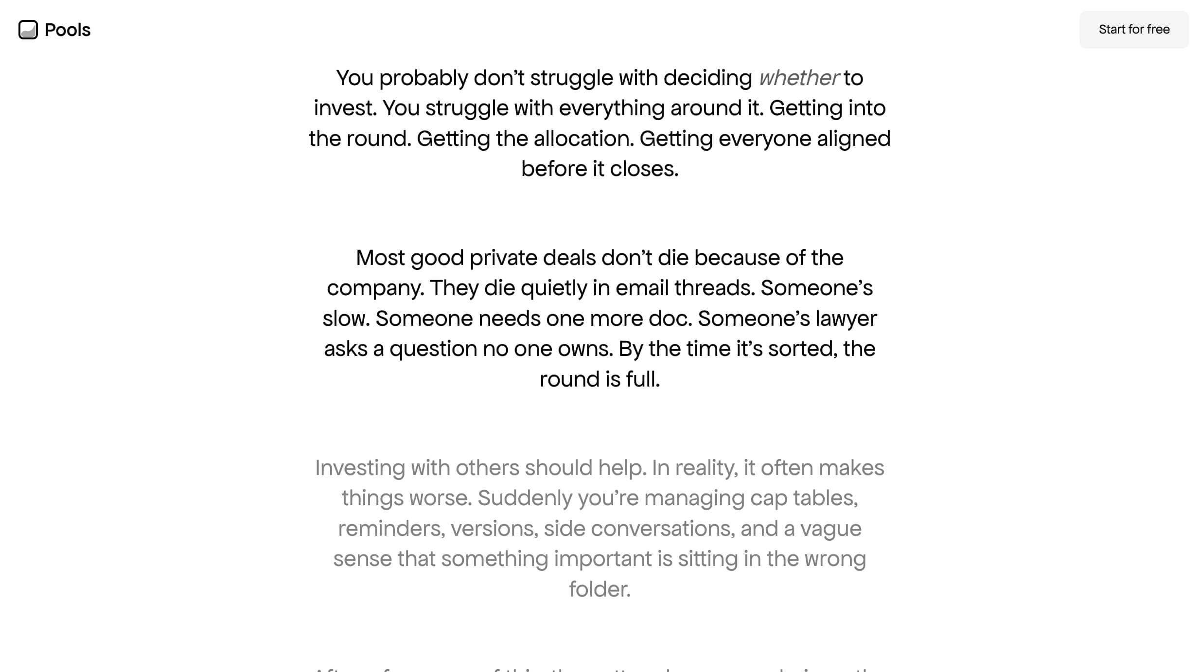

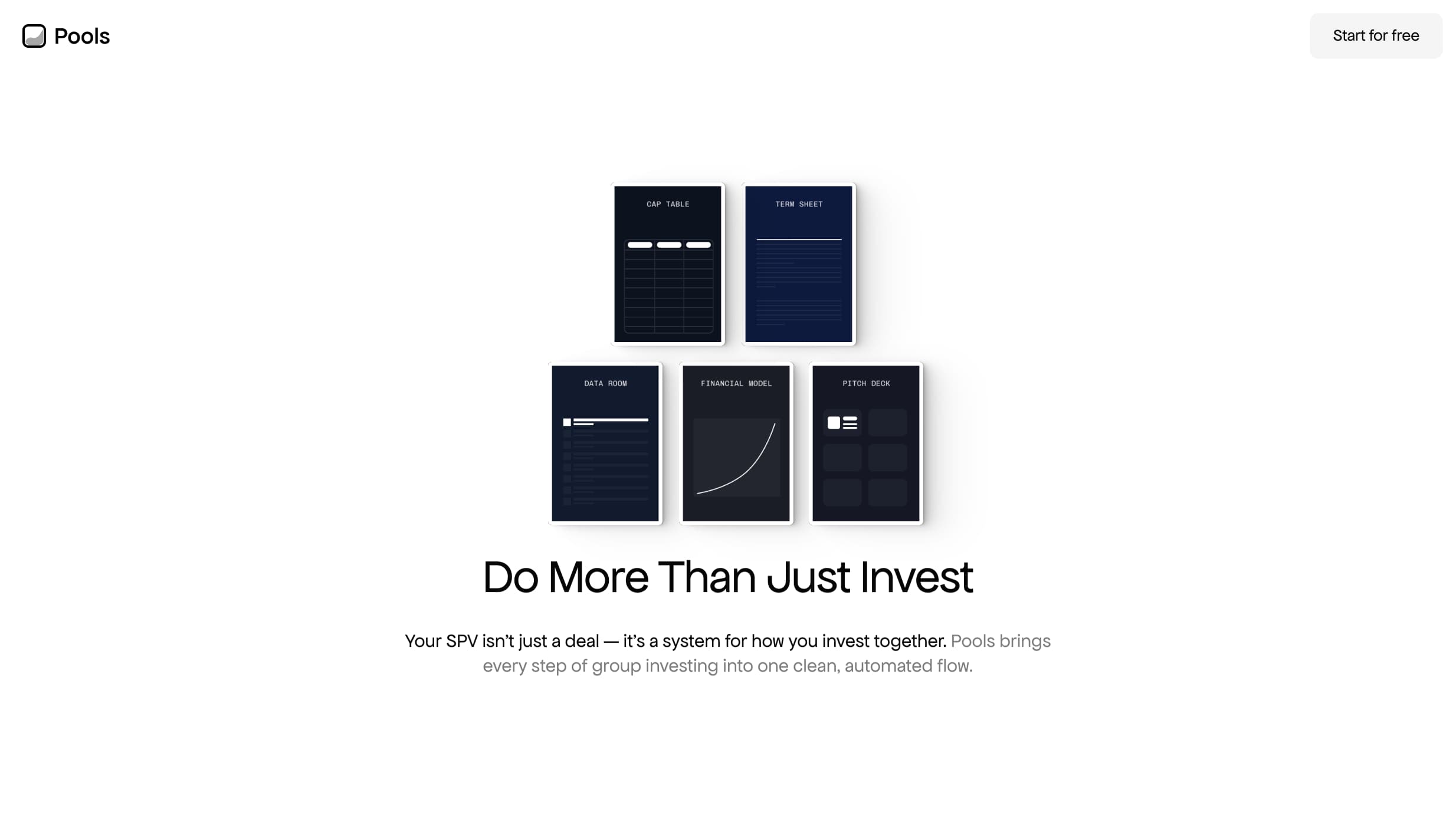

Pools


Contentcloud