Enter password to view Website Audit
Analysis
Website
SCAILE Technologies GmbH
Analysis
Website
SCAILE Technologies GmbH
Analysis
Website
SCAILE Technologies GmbH
Published on
2026-03-19
For
SCAILE Technologies GmbH
Score
36
SCAILE Technologies GmbH is a Munich/Hamburg-based AI visibility agency founded in 2025 by Federico De Ponte, Simon Wilhelm, Anton Billstein, Sebastian Johnston, and Vinita Ohm. SCAILE builds 'AI Visibility Engines' — a 5-step productized service combining intent research, multi-LLM query testing, content engineering, and visibility tracking — to get B2B companies featured in ChatGPT, Perplexity, and Google AI Overviews for commercial queries. Three pricing tiers: AEO Foundation (30 articles/month), AEO Expansion (50 articles/month, 2 markets), AEO Empire (100 articles/month, up to 10 markets). Clients include Beurer, Impossible Cloud, Building Radar, HeyHoney, Lyceum Technologies, Parto. Supported by Google Cloud for Startups, Microsoft Founders Hub, NCA VC, TUM AI, IFB Innovationsstarter, TUM Venture Labs, Next Media Hamburg.
Market
AI Engine Optimization (AEO) / Answer Engine Optimization / B2B Content Marketing / AI Search Visibility / German B2B SaaS GTM Services
Audience
B2B SaaS founders and growth leads seeking AI search visibility; CMOs and heads of demand gen at scale-ups; German Mittelstand marketing directors; digital agency resellers and partners; startup founders in competitive B2B verticals
HQ
Hamburg / Munich, Germany
Copy
32
Content
28
Social Proof
35
Pricing
38
Strategy
42
Copy
36
Navigation
40
Brand
34
SEO
44
Strategy
30
Copy
Hero H1 Split Across Three Lines Creates Incoherent Reading Order
Score
32
Severity
High
Finding
The homepage hero headline is constructed as three separate animated text blocks: 'Your customers now' / 'search in AI' / 'We make sure you are the answer.' The visual intent appears to be a reveal animation, but in the DOM and in any non-animated rendering (RSS readers, screen readers, social preview cards, crawlers) the text reads as three disconnected fragments. The sub-headline 'The Content Engine that puts you into ChatGPT.' is separated from the H1 by the animated phrase, meaning the logical reading is: 'Your customers now search in AI — The Content Engine that puts you into ChatGPT — We make sure you are the answer.' The sequence is reversed from natural persuasion order (problem → solution → proof, not problem → solution-name → solution promise). A visitor who lands cold and reads straight down receives a disjointed message before the animation resolves.
Recommendation
Consolidate into a single H1 that works without animation: 'Your customers search in AI. We make sure you're the answer.' Then use the sub-headline as the value-prop elaborator: 'SCAILE's Content Engine gets you into ChatGPT, Perplexity, and Google AI Overviews — for the commercial queries that drive revenue.' The current three-part split is a common Framer/Webflow animated headline pattern that looks impressive in motion but degrades badly in static contexts. Test the headline by reading the DOM text linearly without animation — if it doesn't parse, fix the copy structure first.
Content
Blog Section Shows Four Articles — All Titled for German Mittelstand / SME Sales Automation, Not AEO/AI Visibility
Score
28
Severity
High
Finding
The homepage blog preview shows four articles with titles including 'Establishing Digital Go-to-Market Processes for the Mittelstand,' 'Why Your Next Sales Hire Might Be an API Call,' 'Stop Pitching, Start Solving: Digitalizing Go-To-Market Playbooks for Modern Startups,' and 'Stop Guessing, Start Growing: Improving Sales KPIs Through Automation for SMEs.' Every visible blog title is about traditional sales automation and German Mittelstand GTM — not about AI Engine Optimization, AI Overviews, ChatGPT visibility, or the AEO services SCAILE currently sells. This creates a significant brand-positioning contradiction: the hero claims 'We make sure you are the answer [in AI search]' and the blog section immediately below demonstrates thought leadership in a completely different domain. A prospect evaluating SCAILE's AEO expertise sees a company whose most visible content is about SME sales funnels.
Recommendation
Replace the four featured blog articles on the homepage with AEO/AI visibility content that reinforces the positioning: 'How We Got Impossible Cloud to Outrank AWS in ChatGPT,' 'What Is AI Engine Optimization (AEO) and Why It Matters in 2026,' 'How to Track Your Brand's Visibility in ChatGPT and Perplexity,' 'The 5-Step Engine We Use to Get B2B Companies Into Google AI Overviews.' The old Mittelstand GTM articles should either be archived, recategorized as legacy content under a separate tag, or redirected — they actively undermine the AEO brand positioning on every page where they appear. The homepage blog section should be a proof-of-concept of SCAILE's own AEO capability: if you can't demonstrate thought leadership in AI visibility on your own website, the product pitch is self-undermining.
Social Proof
Client Logo Carousel Uses Only Image Files — All 10 Logos Have No Alt Text
Score
35
Severity
Medium
Finding
The homepage client logo carousel shows 10 client logos (Parto, Building Radar, HeyHoney, CraftHunt, Valoon, Impossible Cloud, Heero Motors, Lyceum Technologies, LipoCheck, Beurer) rendered as image-only elements with zero alt text. Every `<img>` tag in the carousel has an empty or missing alt attribute. For a company that explicitly sells AI visibility and correct content signals — including schema markup, entity signals, and FAQ sections as core deliverables — having zero alt text on its own homepage logo carousel is an own-goal. Web crawlers and AI systems that index amilabs.xyz to understand what companies SCAILE works with cannot read any of the client names. The carousel is also triplicated in the DOM (three identical sets of 10 logos = 30 logo DOM nodes total), matching the same Framer carousel triplication pattern found in cocodelivery.com earlier in this series.
Recommendation
Add descriptive alt text to every client logo: alt='Impossible Cloud logo', alt='Beurer logo', alt='Building Radar logo' etc. This is a 15-minute fix and is particularly important for SCAILE given that AI systems crawling the page to understand 'what companies does SCAILE work with?' will find the answer in alt text, not in image pixels. The DOM triplication (30 nodes for 10 logos) is a Framer infinite-scroll carousel artefact — ensure the duplicate nodes use aria-hidden='true' so only one set is indexed by screen readers and crawlers. Beyond the technical fix, the client list is genuinely impressive for a startup (Beurer is a major German consumer electronics brand) — the logos should be working harder as credibility signals, not silently invisible.
Pricing
Pricing Table Appears Twice on Homepage — Once Compact (No Prices), Once Full (No Prices) — Neither Shows Actual Prices
Score
38
Severity
Medium
Finding
The homepage contains two separate pricing table sections: a compact version (Foundation / Expansion / Empire with article counts and plan names but no prices) and a full version (AEO Foundation / AEO Expansion / AEO Empire with feature lists but still no prices). Both versions show 'Book a demo' as the CTA rather than prices. The pricing page (scaile.tech/pricing) presumably has actual prices, but the homepage visitor sees pricing tables twice without ever learning a number. Showing a pricing table with no prices is the worst of both worlds: it primes the visitor to compare plans (activating the 'how much does this cost?' mental model) and then withholds the answer. For an SMB/startup-targeted AEO agency competing against other content agencies, hiding prices introduces friction that loses price-sensitive buyers before they ever reach a sales call.
Recommendation
Either: (a) show actual prices on the homepage pricing tables — if Foundation is €X/month, show that number; (b) remove one of the two duplicate pricing sections to reduce page length (the homepage currently has pricing twice, which is unusual); or (c) replace the pricing table with a single strong CTA block: 'Plans start at €X/month — see full pricing.' Option (a) is strongly preferred for an SMB-targeted service. The double pricing section without prices creates cognitive overhead: the visitor processes two tables, compares three plans across two sections, and leaves knowing only the plan names and article counts. The /pricing page already exists — if prices are shown there, link directly to it from the homepage rather than duplicating partial information twice.
Strategy
Testimonial Section Header Is 'Our References' — German Business Idiom, Not English Marketing Copy
Score
42
Severity
Low
Finding
'Our References' is a direct translation of the German business term 'Referenzen' (client references). In English-language B2B marketing, the standard section headers are 'What Our Clients Say,' 'Customer Stories,' 'Results,' 'Testimonials,' or simply 'Social Proof.' 'References' in English has a specific meaning: people who can vouch for you in a hiring context, or citations in an academic paper. Using it as a testimonial section header on an English homepage signals that the copy was written primarily in German and translated literally. SCAILE targets international clients ('based in Munich and working globally') and operates in English — the 'Our References' header is a subtle trust-eroder for non-German audiences who may misread the section as a list of citations or sources.
Recommendation
Change 'Our References' to 'What Our Clients Say,' 'Client Results,' or 'Testimonials.' The results-led variant ('Client Results') would pair especially well with SCAILE's metrics-first positioning — leading with '+100% inbound leads' and '+€150K MRR' before the testimonial quotes reinforces the outcome-oriented brand voice. Audit the rest of the site for other German-idiom translations: 'Become a partner' (nav CTA) is also slightly unusual — 'Work with us' or 'Partner with us' would be more natural in English. These are small copy issues individually but collectively signal that the primary language of writing was German, which slightly undercuts the 'working globally' positioning.
Copy
Results Section on Services Page Shows Client Logos With No Company Names — Anonymous Outcome Claims
Score
36
Severity
Medium
Finding
The services page results section shows four outcome cards: 'Outranked AWS in ChatGPT search results (3 months),' '+100% increase in inbound leads (6 months),' '+€150K MRR additional recurring revenue (3 months),' '#1 Rankings visible in AI Overviews (2 months).' Each card shows a logo image but no company name in text. The homepage testimonial section does name the companies (Building Radar for the +100% leads result, HeyHoney for the €150K MRR result) — but the services page outcome cards strip the company names and show only logos, making the results unverifiable by anyone who doesn't already recognise the logos. For AEO claims as bold as 'outranked AWS in ChatGPT search results,' a verifiable company name + case study link dramatically increases credibility.
Recommendation
Add company names to each results card and link to the corresponding case study page: 'Impossible Cloud — Outranked AWS in ChatGPT (3 months) [Read case study →]'. The case studies are already built (scaile.tech/case-studies/impossible-cloud, /building-radar, /heyhoney) — connecting them to the results cards closes the credibility loop. The 'outranked AWS' claim is the single most impressive result on the entire site and deserves maximum amplification: a named company, a case study link, a specific query example, and ideally a screenshot of the ChatGPT result. Currently it floats as a logo + tagline with no supporting context.
Navigation
Nav CTA 'Become a Partner' Links to /contact — Misleads Visitors About Partnership Offering
Score
40
Severity
Medium
Finding
The top navigation contains a 'Become a partner' link that routes to the standard /contact page — the same destination as the 'Contact' nav item and every 'Book a demo' CTA across the site. There is no dedicated partner programme page, no partner tier description, no partner benefits, and no application form. A reseller, agency, or platform partner clicking 'Become a partner' expecting a partner programme overview lands on the same generic contact form as everyone else. The nav currently has two links pointing to /contact: 'Become a partner' and 'Contact' — duplicating the destination across two nav items with different implied promises. This is the same broken-promise navigation pattern seen in spartacommodities.com ('Autumn 2025 Product Update' leading to a generic blog) and others in this series.
Recommendation
Either: (a) build a dedicated /partners page explaining the SCAILE partner programme, reseller terms, commission structure, and application process — then link 'Become a partner' there; or (b) remove 'Become a partner' from the nav until a partner programme is ready, keeping only 'Contact.' A /partners page is a high-value growth lever: agencies, consultants, and digital marketing firms serving B2B companies are natural SCAILE resellers. If the partner programme is genuinely live, it deserves its own page. If it is not live, the nav item creates a false expectation and a landing-page dead-end.
Brand
Homepage Addresses Two Different Audiences: 'startups' (Pricing) vs 'global B2B companies' (Testimonials) — No Audience Clarity
Score
34
Severity
High
Finding
The homepage simultaneously targets: (1) startups — pricing plans labeled 'For startups needing visibility' and 'For startups needing initial traction,' the hero sub-headline 'The Content Engine that puts you into ChatGPT,' and blog posts about Mittelstand SMEs; and (2) established B2B companies — testimonials from a CRO and a Director of Commercial Strategy, outcome claims of '+€150K MRR' and '600K unique visitors,' and the services page language 'our engine has generated millions in pipeline for B2B companies across industries.' The ICP (Ideal Customer Profile) switches between sections. Beurer is a 100-year-old German consumer electronics company with thousands of employees — not a startup. Impossible Cloud is a funded cloud infrastructure company. Yet the pricing section repeatedly says 'startups.' A mid-market CMO landing on this page sees a startup-priced, startup-positioned product and self-selects out.
Recommendation
Choose a primary ICP and align all copy to it. If the real target is funded B2B scaleups and established companies (evidenced by the testimonials and outcome claims), remove 'For startups' from the pricing plan descriptions and replace with job-to-be-done language: 'For companies entering a new market' / 'For companies scaling into 2+ languages' / 'For category leaders.' If startups are genuinely the primary buyer, the Beurer and Impossible Cloud testimonials should be framed as 'enterprise case studies' and separated from the startup-audience messaging. The mixed-audience positioning dilutes both messages: startups see enterprise-scale outcomes that feel out of reach; enterprise buyers see startup-priced tiers and wonder if the service is too junior for their needs.
SEO
Footer Address Shows Hamburg — About Page Says Munich — Company Registered in Both?
Score
44
Severity
Low
Finding
The footer across all pages shows: 'Jungfrauenthal 8, 20149 Hamburg, Germany.' The About Us page describes the team as 'Based in Munich and working globally.' The JOIN.com job posting lists the company as 'SCAILE Technologies (Munich).' Three different location signals: footer says Hamburg, about page says Munich, job board says Munich. For a company selling SEO and AI visibility services where consistent entity signals (NAP — Name, Address, Phone) are a foundational ranking factor, having mismatched location data across its own website is a self-undermining technical error. Local citation consistency is one of the first things any SEO audit checks — an AEO agency with inconsistent NAP data on its own site is advertising its own blind spot.
Recommendation
Audit and align all location references across the site: if the primary office is Munich, update the footer address to Munich; if Hamburg is a registered office and Munich is the operational HQ, clarify both: 'Hamburg (registered) · Munich (team).' Then audit all external directory listings (Google Business Profile, LinkedIn, Crunchbase, JOIN.com, Tracxn) for consistent NAP data. This is particularly important for SCAILE because inconsistent location data will cause AI systems (including the ones SCAILE claims to optimise for) to hold lower confidence in entity knowledge about the company — directly demonstrating a gap in the company's own AI visibility practice.
Strategy
No Pricing Numbers Anywhere on the Site — All Three Plans Say 'Book a Call' With No Price Anchor
Score
30
Severity
High
Finding
Across the homepage (two pricing sections), the services page (one pricing section), and the /pricing page, zero actual prices are displayed. Every plan — Foundation, Expansion, and Empire — routes to 'Book a Call' or 'Book a demo' with no monthly price, no starting-from price, no price range, and no 'pricing available on request' explanation. For an agency selling a productized content service (30/50/100 articles per month), hiding all prices is an unusual choice: productized agencies typically use price transparency as a conversion differentiator against custom-engagement agencies. The pricing architecture (three tiers, named plans, feature tables) strongly implies prices exist — the decision to hide them forces every interested visitor into a sales call just to answer the most basic qualification question ('can I afford this?').
Recommendation
Add at minimum a 'starting from €X/month' anchor to each plan, or display full prices. For a productized service with fixed deliverables (30 articles, 50 articles, 100 articles), price transparency reduces sales cycle friction significantly: the visitor self-qualifies before booking a call, meaning only genuinely interested leads reach the sales conversation. If there is a strategic reason for price concealment (custom pricing per market, significant variation by language), add a note: 'Pricing varies by market and language — book a call for your exact quote.' The absence of any price signal — not even a floor — makes the service feel more expensive than it may be, and causes comparison shoppers to bounce to competitors who do show prices.
Frequently asked
Frequently asked
What kind of companies do you work with?
What does a typical project look like?
We've had bad experiences with agencies before. What's different?
Why Framer over other platforms?
How do we get started?
How does pricing work?


V7 Labs


Utila


Buena


Enzai


Centific


trawa


Echo


Portex Global


Othello AI
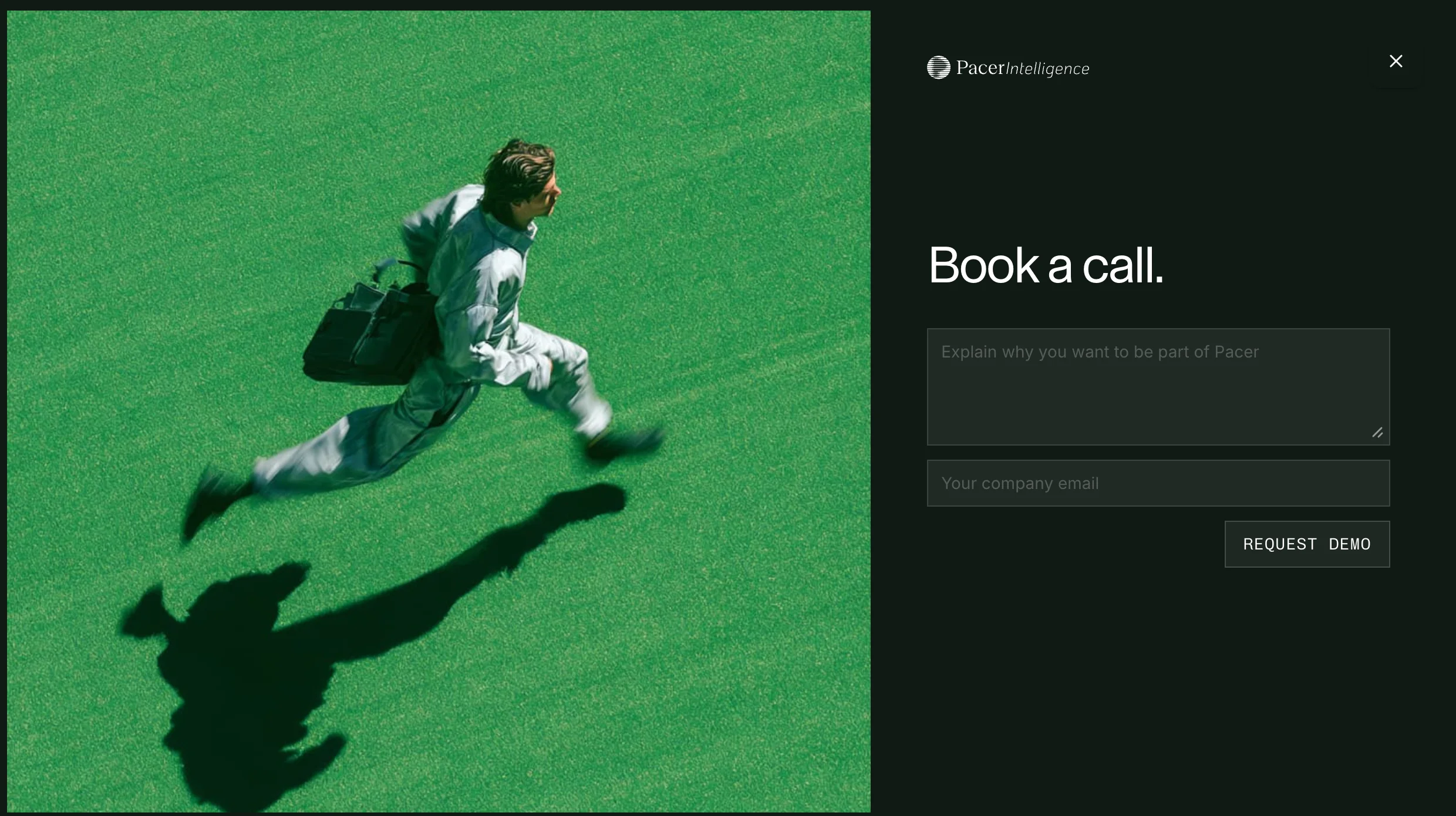
Pacer Intelligence


Pools


Contentcloud